-
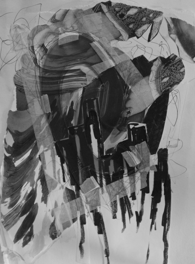
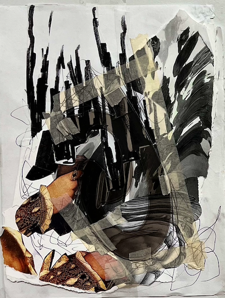
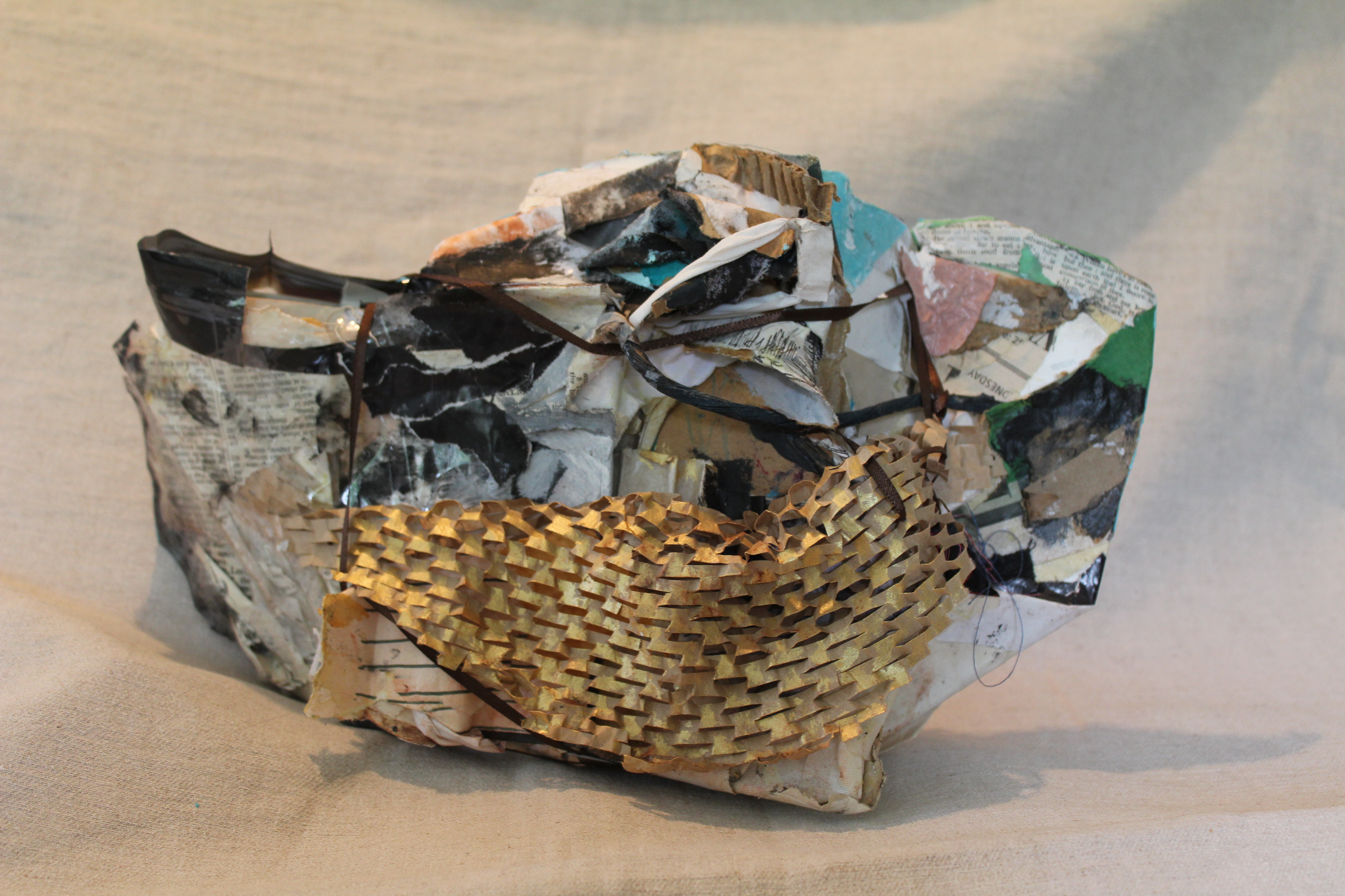
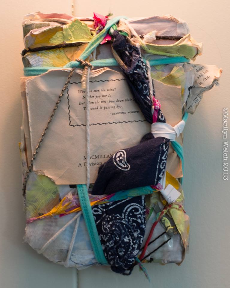
Acts of devotion and concealment, 2015, collage with French curve, 12.5 x 8 inches
Author Archives: johnluna
Kickstarter campaign for Listing [2015]
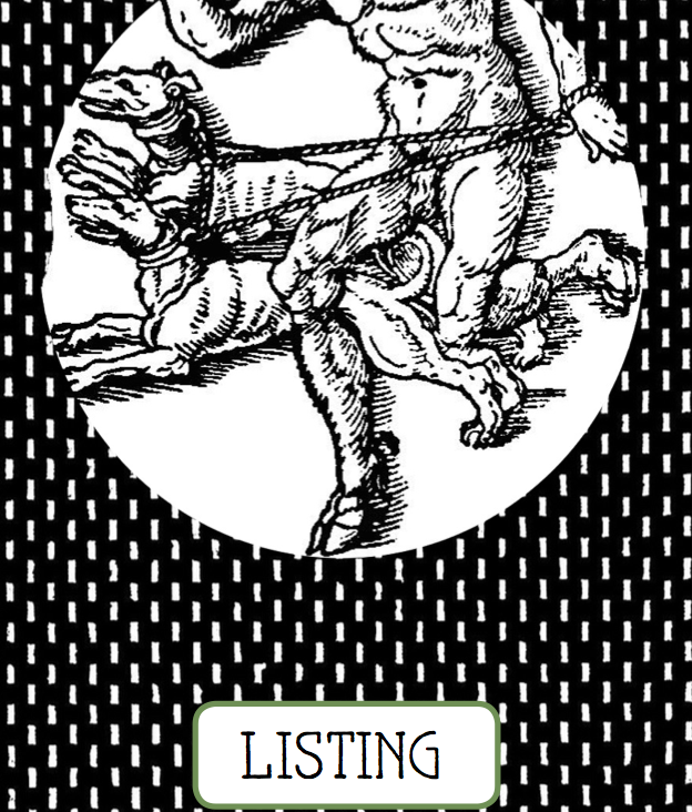 I have just launched a Kickstarter campaign for my first published collection of poetry, Listing, coming out this October from Decoupage Publishing.
Your donation purchases a book in your choice of formats and covers costs for the first printing:
Panel talk with Gary Neill Kennedy, “Art School” at the Art Gallery of Greater Victoria [2015]
I will be giving a brief talk at the Art Gallery of Greater Victoria this Saturday, June 13th, in tandem with a presentation by Gary Neill Kennedy on the history of art schools.
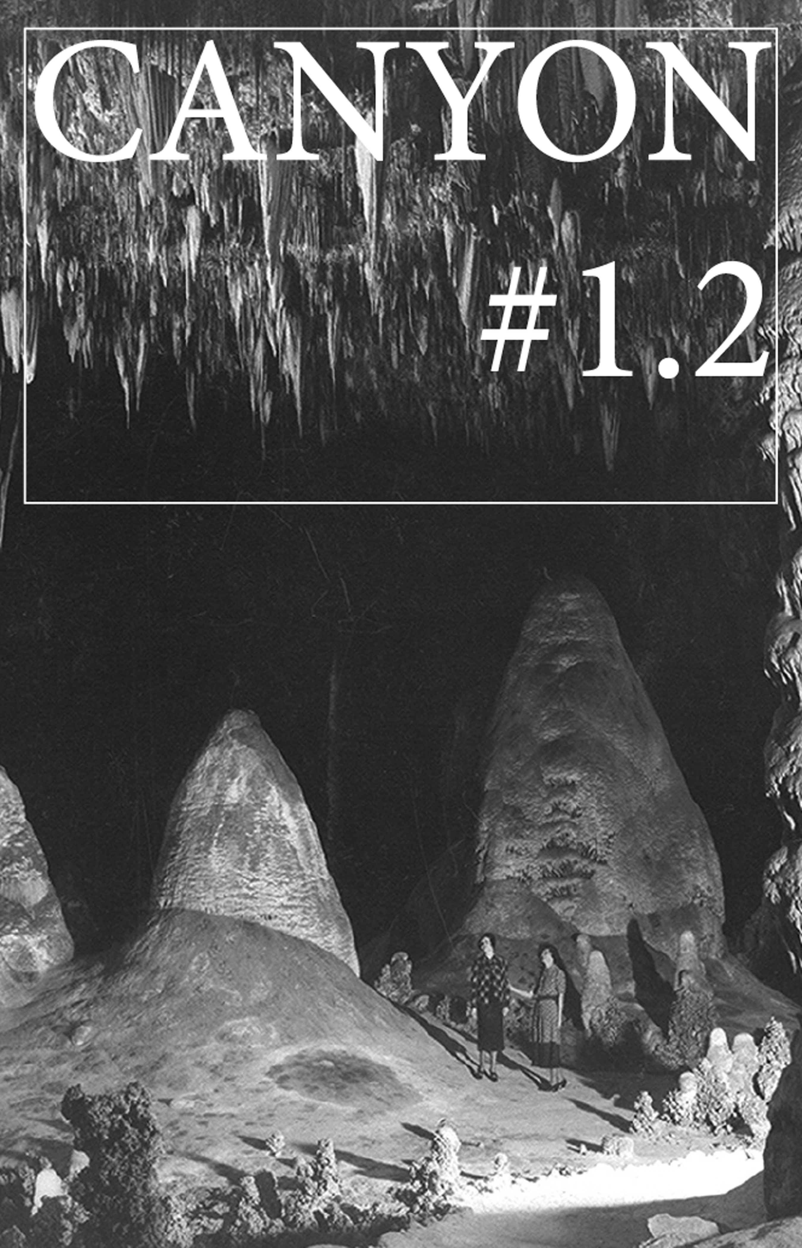
Poetry appearing in Canyon (#1.2, May 2015)
Canyon, is a new publication edited by Michael jess with a West Coast focus. My contribution will take the form of a series of ekphrastic poems related to olfaction and memory.
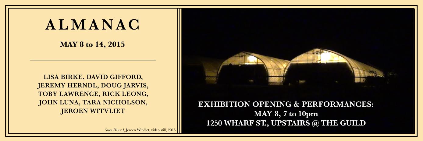
Poetry reading for FERAL Collective: Almanac (curated by Toby Lawrence) at the Guild upstairs, May 8th, 7:45 PM [2015]
Reading from a cycle of poems, “NYC Almanac.”
Poems from forthcoming book, Listing (Decoupage Publishing), published in Cordite 48.0: “Constraint”
Two poems from my first chapbook Listing (Decoupage Publishing, August 2015) have been published in Australian online journal Cordite. Guest editor Corey Wakeling has asked writers to respond to the theme of “constraint.”
Below are links to the poems, “OK’s and Equals part 3” and “Frames part 6.”
The approach to CONSTRAINT in these three (excerpted) long poems was through the consensual idioms of social media. The original long poem that started this cycle, “Thank You”, was actually composed out of materials generated originally as social media updates, posts and comments made by me or by my friends or acquaintances. “OK’s and Equals” was based on the kinds of statements (appeals, declarations, imagistic sketches, questions or invitations usually) I was used to making on social media, but purposefully withheld; instead, they composed a counter-dialogue to the culture of self-publication. These posts were aligned along the spine of older poetry cycle I had written years before, whose language provided the prompts that would normally have emerged from the dialogic character of social media. “Frames” used a similar strategy, but was organized into an informal stanza structure, whose vertical orientation seemed suitable to the original poem that had provided a ‘score’ of sorts for the posts: an elegy. Two more long poems followed. The five parts of the cycle have been collected under the title Listing by Decoupage Publishing and include a foreword by Michael Nardone. Listing will be printed and launched in the summer of 2014.
Founder’s Exhibition at the Slide Room Gallery, Jan 15th-Feb 16th, 2015 [installation images and video]
As part of the 10th Anniversary of the Vancouver Island School of Art, my work – along with Wendy Welch and Xane St, Phillip- is featured in the Founder’s Exhibition at the Slide Room Gallery, from January 16th to February 16th, 2015.
“Paradise Lost”, Catalogue Essay for Xane St. Phillip, Paradise Lost, at the Slide Room Gallery, May-June 2014
This essay was written for Xane St. Phillip’s exhibition, Paradise Lost, at the Slide Room Gallery (May23rd-June 2nd, 2014.)
Though originally intended for a catalogue, this is the only publication of the essay to date.
Xane St. Phillip, “Paradise Lost”
“White and Greens in Blues was a culmination of the inner seasons, just as at times it is not the passage of a swift dawn or a prolonged sunset that is so deeply stirring, but it’s palpability: the concretion of flux.”
– James Schuyler[1]
“White paint is my marble,”
– Cy Twombly[2]
How do we begin to talk about sensation? When we first speak to share our awareness of the changing temperature or an unexpected flavour, or cry out in alarm, or swear in agitation (and all of these things might register both pleasure and pain) to define hot or cold, sour or sweet, damp or dry, we are social animals; trying to fix between ourselves and others a borderland between exterior and interior experience, a shared skin. Colour is a comprehensive language that allows this exchange to find its middle ground, a shared domain that, while certain – unless one is colour blind a red light is red, not green – is also variable in affect (is that red invigorating or angry?)
Artists, negotiate colours partly through theory, red read as complementary or analogous, saturated or neutralized, but also pigments: Cadmium Red or Venetian Red or Alizarin Crimson, each one a distinct entity. Burnt Sienna, a low-intensity orange-brown the colour of cordovan leather, is cooked Siennese dirt, rust-coloured because of iron oxide. Thus, on a chemical level, colour is alchemy. The analogy holds up for our understanding colour theory too. Just as we are scarcely aware of a sensation before conveying it to others, so too we hardly begin to describe a colour without relating it to other colours and perceptions of colour in an endless feedback loop. Colour as an idea in the eye of the beholder, but in the mouth and index finger too: promiscuous, jealous, various, collusive, infinite, resilient and never wrong.
Xane St. Phillip’s “Paradise Lost” is about specific sensations – warm, cool, closed, open – but also about what sensation itself is, or (in keeping with the title’s elegiac tone) the gap between sensing and saying. Perhaps the most poignant examples of this gap come via images of stars.
One of two floor pieces in the gallery uses a pattern of interlocking eight-pointed stars of the kind frequently featured in mosque-decoration. St. Phillip crafts this image using black linoleum tiles, a connection to the exhibition space’s history as a schoolhouse (the gallery floor is composed of the same make of tile in a weary institutional greige.) In accordance with the Japanese principle of Nōtan, or ‘dark-light’, the graphic black pops the background flooring into sharp relief (I am reminded of critic David’s Sylvester’s characterization of Henri Matisse’s use of dark and light: “light flares out of the blackness.”[3]) The star-patterns shift from positive to negative in constant, symmetrical synergy.
Above, the ceiling’s similarly institutional acoustic tiles are also spangled with stars, these cut out of white mat board. In his artists’ talk, St. Phillip remarked that, given more time, they might better have been made of gold leaf, but I disagree: the mat board looks fresh, present tense and lean; he has used a framing material to make a drawing, reversing the roles of edge and center, punching holes of implied absence in the drop-down ceiling. The effect is at once both off-the-cuff and artisanal (St. Phillip worked for years as a professional framer), an urbane combination thematized throughout the whole of the show.
The gallery’s main window is veiled by a four panel, freehand “cut drawing” executed by VISA student Sarah Cowan. The pattern is an “inhabited vine,” a Roman motif featuring an arabesque line enlivened by animals, in this case birds and rabbits. During various hours of the day, arcing southern sunlight splashes vibrant colour through the cuts from the yard outside – unexpectedly from a graffiti mural on the side of a steel shipping container- whose lyricism, extracted and transfigured, glistens; pointillist daubs bobbing in sun-limned filaments. Cowan’s intuitive contours recall Matisse’s phrase, “drawing with scissors”, and the shifting light’s activation of colour into line echoes his scheme of window and wall decoration for the Chapelle du Rosaire at Vence, France, in which the glow of stained glass is carried to a drawing on the opposite wall. Here, there is the same combination of soft mutability and atmospheric power brought about by an economy of means, but with the intimation that the combination has been chanced upon, and that all (from the graffiti to the paper to the room itself) is provisional.
Other influences St. Phillip cites throughout the show include colour-theory pioneers Joseph Albers and Johannes Itten, along with architect/painter Le Corbusier (whose book, Le Poeme de l’angle droit, was propped by the east window during the opening). These influences are evident in square, modular paintings, whose wooden supports are St. Phillip’s tribute to the beveled tongue-in-groove paneling that lines three of the gallery’s four walls. The grooves become borders for dividing planes of colour selected from the Colour-Aid System, the designer’s tool that Albers himself used with students. Of the varying tones and temperatures, St. Phillip says, “I tried to have neutrality and temperature and value all in balance in these pieces…every one tells a different story.”[4]
Minimalist in spirit, the wall pieces reward close scrutiny, though scanning them is literally staring at a wall. Density and duration add hidden weight to the matrix of the curt, closed squares via the application of colour to surface; some of the boards were painted in a dozen layers to achieve the right look, while others were touched only twice. The architectural character of the works becomes more focused when each piece is viewed as an experience unto itself, as if a colour palette for an imaginary interior. Viewed this way, each becomes like a still-life painting with almost nothing in it, revealing the real substance of still life: light and shadow, stasis and transformation, palpable presence or conspicuous absence.
The way in which the gallery’s vertical lines become a rhythmic substructure for the wall pieces has the effect of sharpening the border between work and wall, as if reminding viewers of the here-and-now-ness of experience in the specifics of surface, support, texture and pigment. This argument is curiously reversed on the south wall, where a diptych of canvasses painted in soft blues seems to melt into an even paler blue alcove.
Playing to the space, St. Phillip has chosen the one perfectly smooth half-wall of the gallery to mount a conspicuously painterly piece. Five hues of blue pigment have been scumbled, dragged, rubbed on, pulled off, plied with turpentine burns and basted with wet-into-wet glazing, resulting in a surface that while purportedly not ‘about’ water nonetheless recalls both the diaphanous transitions and dense, gestural confectionary of Monet’s Nympheas. The bold move to mount the diptych on a blue wall floats its tensions in a pool of coolness that seems to suspend it conceptually as well as pictorially.
Does an abstract painting lose its expressive integrity when threatened by a literal comparison to landscape, or, does its history of marks become only so much decoration when its colours are ‘too beautiful’? These problems have been explored before with care, by another St. Phillip’s influence, Richard Diebenkorn, notably in his well-known series, Ocean Park. A more contemporary struggle St. Phillip understands is the inescapability of the quotation marks we now place around abstract painting itself (he often points out that many students do not learn to make abstract paintings, but only copies of other abstract painters’ work.) The blind of the blue wall is a kind of patient parentheses that displaces the object-hood of the painting in an imagined space apart. The effect is theatrical but also absorbing, the split of the diptych hinting at a seam in the curtain, impenetrably imperturbable.
In the same way, a nearby orange canvas offers punctuation chased with relief. The west wall, clad in horizontal boards, is painted along its surfaces, gaps and crevices in mauve, pink and turquoise, respectively, all sharing the same value, with resulting subtle discords and contrasts. The unsettling physical twinge associated with discord colour combinations is the result of upending the mind’s expectations that purple must always be dark or orange always pale, when darkness necessarily conveys heaviness and pallor lightness. Like orange desert rocks against a cobalt sky, or the wan violets and greens of Aurora Borealis, discords often feel transportive and weightless. The bold, glazed oranges of St. Phillip’s minimal square act as both charger and foil to the wall’s split differences: orange supports pink and opposes turquoise, electrifying the gaps between boards; at the same time, the flat, matter-of-factness of tinted canvas offers – as the artist has remarked – a relatively static ground for the eye. A small scuff mark in the corner of the orange (the canvas was primed outside and picked up dirt) settles the orange as picture like a signature.
Orange and mauve are situated on the colour wheel on either side of red, the absent presence that, according to the artist, colours much of the exhibition. In Matisse’s famous painting, Red Studio (1911), the entire space seems to have been flooded in a hue the tone and temperature of blood. Matisse picked up this red from the murals of the Villa of the Mysteries at Pompeii, a source that has inspired painters – from Jacques-Louis David to Mark Rothko – since its excavation in the 18th century. Matisse’s painting presents a concrete thesis on the convivial flux uniting nature and culture: a small statue of a nude stands in for a resting body, plants echo the contours of patterns; the clock has no hands, and everything is transparent that is not quickened by life or art.
Settled into a niche in the St. Phillip’s mauve wall is a small, six-pointed star rendered from black floral wire. St. Phillip dedicated the show to artist friend Rachel Berman, who passed away the week the show opened. As a counterweight to the orange canvas, it is a frail token of mortality, an Et in Arcadia Ego whose elegiac character is also present in the exhibition’s most obvious nod to history (as well as its most aggressive architectural intervention). A double-row of columns lead from the space close by the memorial niche, and gallery entry to an open door leading outside to a cement basketball court and, beyond that, a grassy field. The millwork surrounding the entry and exit doors is loosely painted a soft hospital green.
The columns are simple structures composed of flat millwork that has been whitewashed and gently stenciled with a stylized cypress tree motif. They are in part a cunning solution to a difficult installation space, as one of the columns masks a structural support stud; the others are there for rhythm and symmetry (St. Phillip, a stickler for proportion, once designed a studio based on Palladian principles). This use of nature in quotation within a rigid geometry recalls the classicism of Le Notre’s gardens at the palace of Versailles, a reading complemented by another floor piece, a ‘reflecting pool’ of blue linoleum tiles based on an ancient Roman mosaic motif. Cypress-columns compose a kind of allée to lead the viewer outside, where one is confronted by an actual Italian cypress sapling, planted in the scrubby urban grass.
Whitewash (with its connotations of sanitizing ugly truths) has a long and varied history of bestowing, not only lightness to a surface, but purity, with the latter’s twin connotations of hygiene and separateness (white is cooler in a hot country; lime wash possesses antibacterial properties.) Here, whitewash is primer for an impressionistic mirage’s primitive rhythms. As heralds of an obscure past, they speak to the suspension of disbelief that the garden proposes, even as the rudimentary structural proposition of the allée disciplines the positioning of those passing through. This washed-out white is the formal echo to the white and shadows of Cowan’s cut window screens; both are votive scrims, softening or concealing reality while proffering virgin surfaces for archetypal devices.
Discussion at St. Phillip’s opening included questions about his choice of title, Paradise Lost; some thought it alluded to the role of artifice that allows the ordinary (a scuffed institutional floor, the creases between clapboards) to grow expansive in the imagination. David Sylvester writes about a cut-paper composition of a swimming pool by Matisse:
“…Volumes and space seem to switch roles with each other […] sometimes the blue areas seem to be the swimming or diving figures. Sometimes the figure seems to be the white and bare canvas contained within an open blue shape. Sometimes the blue shapes seem to oscillate between being figures or limbs and the empty spaces around and between being figures or limbs.”[5]
The formal oppositions with which St. Phillip interrelates artwork, colour and architecture ultimately reveal a locus of control that must make its peace with the graces and fallibilities of space, time and circumstance so evident in this venue. Along these lines, the exhibition title also recalls Ezra Pound’s rueful coda to his monumental address world literature, The Cantos:
I have tried to write Paradise
Do not move
Let the wind speak
that is paradise.
These lines are more complex than they first appear to be. The listener must stop, but the wind must move in order for it to speak; to, ‘let the wind speak’ is to momentarily subtract authority from poetry. But this silence is the reader’s also, who listens out of range of the interior call and response of Pound’s poetry. This gesture of self-abnegation is kin to the kind of immersion that colour-field painting has historically called on viewers to embrace as a means of achieving a bodiless, meditative state. But as a mandate for an exhibition, it is also willingness on the part of this artist to allow viewers the freedom to drift from interest to interest. St. Phillip’s casual care approximates an open-ended invitation concealing the efforts that have produced it, a gesture of hospitality reminiscent of the Arabic and Mediterranean cultures he candidly admires. It is also a kind of metaphysics of being at home in the world, an elevating of the elements and principles of design that unites with an elegant gesture the cosmetic with the ontological.
[1] James, Schuyler, “Mark Rothko”, ArtNews, 1958, reprinted in James Schuyler, Collected Art Writings, Santa Rosa: Black Sparrow Press, 1998.
[2] Qtd. In David Sylvester, “The White Originals/Cy Twombly the Sculpture”, Art In America, July 2000. http://www.cytwombly.info/twombly_writings2.htm
[3] David Sylvester, “Matisse”, from About Modern Art, Critical Essays, 1948-2000. London: Pimlico, 2002. P. 143.
[4] All quotes by St. Phillip are from his artist’s talk at the Slide Room Gallery, June 1st, 2014. https://www.youtube.com/watch?v=OPefBoZ7ezk
[5] Sylvester, p. 143.
Sandra Meigs at Open Space [2013]
The following review was written for Sandra Meigs’ exhibition, The Basement Panoramas, at Open Space Victoria (Nov 1st-Dec 14th, 2013). It was published by Canadian Art Magazine online.
At the Bottom of Everything
Sandra Meigs, The Basement Panoramas, at Open Space, Victoria
When Sandra Meigs met me at her exhibition of murals and accompanying installation work, The Basement Panoramas, and we ‘walked’ the paintings, twice I misheard her saying “breathing” as “grieving.” It was a telling mistake. The works are rooted in an immediate personal history: in January 2011, Meigs, who had recently married and purchased a home, lost her husband to cancer; during their final months together, she started to relate to the crawlspace and bedrock of the ninety-year-old house to mortality, a space removed from the traffic of waking life, yet, in the artist’s words, “containing time.”
The first of the murals, Red. 3011 Jackson. (Mortality), named for the address of the house, relates this evocative reckoning to the networks layering the crawlspace: ducts, wires, cables and fuses, redundant or functional, vestigial or retrofitted, surrounding and commuting the vortex-like swirls of the stony floor. The twenty-five foot long mural was composed of photos of the crawlspace taped together to form a panoramic view, from which a schematic rendering was derived for projection. The drawing’s contours look liberated in the radiant layers, supplying a bloodied lushness offset by Meigs’ neat parsing of constituents: a fuse box is “portal electrical”, an old five-panel door, the “door of mortal birth” and protruding bedrock a Wagnerian “universal realm.” The invocation of colour as transforming wavelength recalls Matisse’s iconic Red Studio (1911): a body-temperature continuum of fluidity and atmosphere, the objects within it (especially artworks) limned with light as if radiating significance. Meigs’ basement is a metacognitive space, a set of generative coordinates in which – as in Matisse’s clock face without hands – the explicit depiction of action (past-present-future) is withheld.
Mortality became the first of a series, and Meigs’ research for the pictures that followed undertook travel. Blue. 1000 Mountain Rest. (Breath) takes its architectural underpinnings from the Mohonk Mountain House, a massive Victorian-era castle resort in New York State with storied origins in Quaker-based pacifism. This retreat was, for Meigs, also something of a sojourn into prior work: for her 2009 series, Strange Loop, Meigs made trips to Newport, Rhode Island, and the Cooper Hewitt Museum in New York, visiting several examples of 19th century Shingle Style architecture. Meigs’ stripped renditions of these interiors simultaneously suggest the magical reality of children’s book illustration, and a labyrinthine tracery of cognitive routing: blank faces stationed on newel posts, coffers and risers in ceilings and staircases rolling along like conveyor belts; eyes and vortexes stare or suck.
Breath is based on the porte-cochere of the retreat, revised as a place of purgatorial procession. Meigs’ original drawing for the piece features figures composed almost entirely of faces seen in profile, pulpy caricatures reminiscent of Ensor or Guston. In the mural, rendered in quivering currents of warm and cool contour lines, facial features have become vulnerable whirlpools. As in Meigs’ past approaches to the figure (in series such as Dummies, Resin Heads or Fold Heads), orifices are both the central focus of the Breath bodies, and also agents of distraction or deflection, like eyes painted on the wings of a butterfly, passive-aggressively protective. Tellingly, of the four murals, Breath is the only work without text. Also distinct is a painterly swirl that tugs at the surface tension of the mural like a bathtub drain. Meigs related the mural to breathing exercises she practiced while grieving, an elastic unit of measurement between the “shut-down” of mourning and the present tense.
Meigs’ travels also led to her sisters’ home in Pennsylvania, the crowded basement of which provided the compositional elements of Grey. 224 Main. (Transformation). Unlike the other mural compositions, the panorama depicted in Transformation has been mirrored both horizontally and vertically. Lateral slicing of the panorama sandwiches the basement’s ceiling joists in the middle ground of the picture, furnishing (in Meigs’ words) a “spine”. On the left side of the vertical split are words suggesting beginnings (“miracle”, “realization”, “emergence”), and on the right, endings (“cessation”, “vanishing”, “extinction”, “eclipse.”) Meanwhile, the symmetry of the central split doubles a flood lamp to suggest two staring eyes, annotated with tags, “here” and “gone,” over a sprawling vortex.
In Transformation, the absorbent ground Meigs used to prime her supports works to great effect; lacking the chromatic saturation that radiates from the other murals, the grey layers appear more delicate, the apprehension of subtle variables of opacity and translucence implying both volume and vacancy. Likewise, drawing lines and captions, less buoyantly deployed in an achromatic scheme, seem analogous to scattered old tools featured in the background (a saw, a clock, some bottles, a broom) and their matter-of-fact mirror images. The basement becomes an extended still life in the tradition of the memento mori: objects are borne into light, then life, by being observed and painted, and observed once more. Rendering them everlastingly both preserves and precludes their continuity; they neither carry on nor fall away.
I am reminded of Meigs’ milestone series, Dummies, eerie ‘portraits’ of surrogate bodies, like the fantasies of Arcimboldo or de Chirico’s mannequins, but painted from actual puppet-like constructions of household objects the artist constructed in her studio. In a 1997 interview with Nancy Tousley in Canadian Art, Meigs related the Dummies to the memory of having to identify her brothers’ body at the morgue. The notion of an alternate self engendered from fragments of reality is an age-old concern of still-life painting; it’s vitalization via art is the stuff of myths: the golem, Pygmalion, Frankenstein, The Invisible Man. There are no dummies in Transformation, but the face perched over the vortex, like a Romanesque weigher of souls, is key to the same will to vitalism that has informed Meigs’ work for decades.
Victoria-based writer Aaren Madden compared the repeated images of faces in Meigs’ Strange Loop to the moment in Ludwig Bemelmans’ classic story Madeline when a child convalescing in hospital after appendicitis apprehends, “a crack on the ceiling that had the habit of sometimes looking like a rabbit.” It is an interesting coincidence that the story goes on to see Madeline displaying her appendix scar to the wonderment of classmates, uniting crack and scar, illness and becoming. This invalid aesthetic features strongly in Yellow. 435 Longmeadow. (Insomnia), a warm tableau of vibrating yellows and blues, divided up by four barriers, in the form of sketched curtains that partition a basement inhabited by four figures. This is the first time I can recall seeing figures rendered so anecdotally in Meigs’ work. There is none of the peculiar theatre of absorption and repulsion that has confronted viewers previously. Instead, naturalistic figures perch or bask in empty, radiant spaces, surrounded by words that seem to catechize the past: “gamblers”, “loners”, “drifters”, “creeps”, “lost souls”, “dreamers”, “healers”, “go-getters”, “saints.” On the left edge of the mural, a Whitmanesque invocation calls these characters to prepare for their reckoning, while the same folksy vernacular supplies a series of questions at the right:
“What?” cry the losers.
“Where?” shout the go-getters.
“When?” speak the sweet souls.
“Why?” ask the planners.
“How?” ask the defeated.
“What lies beyond the illusion?” say they.
Meigs identifies the partitions in Insomnia with the curtains used to divide a basement used for a children’s rec room, also in a sister’s house, this time in Vermont. These frame stages for a morality play, even as the lint-lined cobwebs caused by a defective dryer vent drape like a discarded tissue of temporal vestments. It is tempting to read the murals as a whole (and Insomnia in particular) as an allegory of painting not unlike Courbet’s The Painter’s Studio: A Real Allegory of a Seven Year Phase in my Artistic and Moral Life: a self-portrait of the artist at work, dreaming an environment populated by models and supporters, made real by art alone.
For the exhibition at Open Space, Meigs has included two supplementary projects. The first is a collaborative project with artist Mowry Baden, and consists of lamp-like headgear that allows viewers to rotate the photographic panorama that produced Transformation at a slow glaze or dizzying blur. At the right speed, saccadic blindness relieves nausea, and the piles of antique objects that crowd the basement underworld become a flattened sea of neutral blues and golds. The lampshade’s cliché connoting of tipsiness – ‘life of the party’ -, combined with the solipsism and self-consciousness induced by the headgear, prime viewers entering the gallery for the implicit tactility of the immersive murals.
Nearby, are The Bones in the Golden Robes, a series of shrouded, robot figures lined up along a catwalk-like platform. Concentric bands of yellow and white on platform and shroud heraldically unite the tableau with Insomnia. Five robots stand immobile as a sixth roves over the platform with juddering perambulations, causing clappers beneath its canopy to clack like weathered wind chimes (a contribution aided by the input of Victoria composer Christopher Butterfield.) The ghost-like shrouds are both blind and anonymous, their hunched forms, and lap-like projections, pantomiming an awkward attendant carrying a tray or mendicant begging for alms; they are contingent figures. Reminiscent of both patient and nurse, they evoke a division of artists’ roles, between exemplary sufferer and therapeutic mediator, a split recalling Jasper Johns’ contrary categories of “watchman” and “spy.” Oblivious to the viewer in their queue and clatter, they cast the rattle of bones into the meditative reverie of the murals, like branches tapping at the window.
The Basement Panoramas is at Open Space from November the first through December the 14th, after which the murals and selected paintings will be shown in two concurrent exhibitions in Toronto, via the Susan Hobbs Gallery, and the Georgia Scherman Projects, January 23rd to March 1, 2014.
Open Space will publish an illustrated book in conjunction with The Basement Panoramas with essays by Jen Hutton, Toby Lawrence, and Joan McNeely.
EriK Volet at MoCL [2014]
This short essay was written for EriK Volet’s show, Scenes from the Yiddish Theatre & Other Paintings at the Ministry of Casual Living (June 1st to 15th, 2014), and was featured in a catalogue produced for the show.
Elimination Dance
There is an anecdote about Philip Guston in which he relates the experience working in the studio as being in a room crowded with people. As the work progresses, the people leave; maybe, on an especially good day, the artist is able to leave too. Suppose the characters are ancestor ghosts. Hungry ones. Assume being an artist is, as Jasper Johns once asserted: “consuming and being consumed” (is that what reading/writing is as well?)
Erik Volet’s studio in the Ministry of Casual Living is tightly squarish, with a fresh, thin coat of paint skinning old walls that give way to a new ceiling made of corrugated metal that closes down like a lid. There are photocopies on the wall with green paint spattered on some of them, and green paint in jars or plastic containers on the floor. There are more drips, the spore of an absentee automatism, around the containers, floor and a crusted easel.
On one wall is Volet’s large painting, The Yiddish Theatre. The painting reminds me, though only in retrospect, of Guston’s paintings of boys enacting peculiar rituals in the guises of games. Or Ben Shahn’s wonderful illustration of two boys facing each other in a wood with masks on, close enough to hear one another breathing. Also, Picasso’s old blue-period painting of a boy leading a horse without reins: something is happening so that the painting is showing without telling, a pictorial mystery as to how it’s accomplished. It turns out that the old photograph Volet used for the painting (“I don’t know how long I’ve been carrying that picture around for”) is of dummies posed in a reenactment of folk theater, making his effort an animate rendering of false players.
In a recent interview, Volet argued that a picture constructed from a photograph might be just as much a work of Surrealism as might an automatistic abstraction. There is something about the image that became The Yiddish Theatre that looks definitively ‘found’, perhaps by virtue of still bearing unmistakable traces of having been at some point lost. Coincidentally, Volet and I end up talking about that famous picture of loss, Arshile Gorky’s The Artist and His Mother, and also some of Gorky’s other pictures (and titles): The Water of the Flowery Mill, The Plough and the Song and of course, The Liver is the Cock’s Comb. Aren’t these barnyard abstractions really some exile’s recollection of folk theatre?
The painting has more and less layered areas: a thin dragging fringe of broad strokes traces the hem of one actor above a shadow that has dark, dumpy curves like a ladleful of jam. The shadow adjacent to a figure’s whittled profile looks like a sculpture of a speech bubble, carved with a hatchet and cast in grey rubber. Thin contour lines of canvas leak out between broad, open tones of flattish black. The grey scale, he says, helps with the deliberateness of the composition, and in this context it also reminds me of a passage from Anne Carson’s Autobiography of Red:
“Depression is one of the unknown modes of being.
There are no words for a world without a self, seen with impersonal clarity.
All language can register is the slow return
to oblivion we call health when imagination automatically recolors the landscape
and habit blurs perception and language
takes up its routine flourishes.”
Volet was interested in drawing and graffiti as a teenager, and one day saw a painting show of Noah Becker’s in the old Winchester Gallery. It is the first instance he can recall of the experience of seeing a painting as something contemporary. He called Becker up. Becker advised him to look up ‘a surrealist hermit’ who turned out to be Glenn Howarth, RCA. Howarth offered instruction, in Volet’s words, of “praxis,” or how to make a painting. For instance: lay the paint on in patches of juxtaposed value rather than in lines, difficult because Volet sees himself as “an artist especially reliant on line.”(It seems true… in Volet’s sketchbook, a foot of a figure whose instep and arch are delivered with Pre-Columbian buoyancy.) Howarth also encouraged him to freely associate between forms and images. At university years later, where Volet claims to have been a “stubborn autodidact”, Sandra Meigs supplied the other half of the chance/construction formula, encouraging Volet to diagram and plan his work.
Me: “What do you think a painting is for?”
EV: “What, do you mean, for the viewer?”
Me: “Sure, I guess, since we’ve both been to art school and had those conversations about the viewer”
EV: “When you’re in here, and I’m in here, and we’re looking at this, I don’t know – are we the viewer?”
As we sit regarding the medium-large painting in the compact space, Volet is talking about Kafka, and notes the way that so many of the events in Kafka’s stories happen in “confined spaces.” Walter Benjamin wrote that Kafka’s characters pace on narrow rugs dreaming of a racetrack; the analogy is to something Kafka called the Nature Theatre of Oklahoma. Hearing Volet talk – about Alfred Jarry (whom he painted riding a bicycle) about Surrealism, about Jan Švankmajer’s films, Max Beckmann’s compositions, or Mircea Eliade’s ideas about myth – turns the studio itself into a sort of premise or precipice for thinking about art and cultural history as a training ground for theatre-sports of memory. His selection of found photos for paintings obeys laws of chance, but is the carrying around of the photo, letting it get wrinkled and acquire new, incidental but assignable history, a history of perambulation, also important?
Volet describes the arrangements artists make with other artists, past and present, as “a ricocheting dialogue.” I am interested in whether contemporary painters whose use of style and content undertake past art historical moments (Kai Althoff, or Peter Doig, or Neo Rauch) are -if not allegorizing art-making as cultural memory as a return of the repressed- thematizing it within painting. What Volet delineates in our conversation seems more tactile and gracious. His expressed interest in ceremonial time, the time of ritual that connects a person to a larger continuity of collective memory, seems important in this regard. Can the reenactments of the studio, of Bohemian movements and subcultures, and the shabby, immediate theatre they construct around themselves, be read as a sustaining congruity with a meaningful collective experience?
Talking with Volet, I am curious to note how many familiar landmarks of the Victoria arts scene he seems to have had contact with, and the continuum that is conjured up in the way he references past teachers and influences. The overarching impression I have is that what might be mistaken for naïve anachronism or nostalgia in his work is instead the conscientious cultivation of a coincidence of affiliation. In conversation, he mentions Aimé Césaire as a Surrealist who never meant to be a Surrealist. When we talk about Antonin Artaud, he refers to an essay by Susan Sontag that argues in favour of reading without being sure one understands the text. In The Yiddish Theatre, the signs made by his characters are multivalent but grave, though those who enact them seem only half serious or sure of their roles: it’s painterly fatalism that relates them at last as the found objects of a misplaced history.

